 This is an example of a website, which isn’t a good looking website. Basically, this site is completely too dark, maybe the text is clear to read but the whole page is like messed up and seriously I think it looks awful. The colours just don’t work together properly, it makes you feel bored and sleepy, and honestly it. Also Times New Roman is the ugliest font ever, but it has been used on the whole website, which isn’t a good idea. The only one thing I found pretty interesting is the logo on the top left corner, I like the composition of it the shield and the crossed swords reminds me of crusades, knights etc which I’m interested in. Generally I do not like this website at all.
Tuesday, 10 April 2007
research - bad website
 This is an example of a website, which isn’t a good looking website. Basically, this site is completely too dark, maybe the text is clear to read but the whole page is like messed up and seriously I think it looks awful. The colours just don’t work together properly, it makes you feel bored and sleepy, and honestly it. Also Times New Roman is the ugliest font ever, but it has been used on the whole website, which isn’t a good idea. The only one thing I found pretty interesting is the logo on the top left corner, I like the composition of it the shield and the crossed swords reminds me of crusades, knights etc which I’m interested in. Generally I do not like this website at all.
research - good website
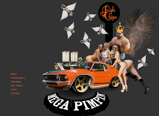
 This website is a great example of skill and creativity of the people who made it. It’s been written in flash, technology using designs in motion. Very interesting thing about it is that every time when you launch the website it’s coming up with different colourful layout and design. However not all layouts are clear as the others, but generally the web designers have made the masterpiece of web and animation design.
It contains all what is needed in portfolio, so all their works, latest news, contact and a short note about the authors.
Actually the website is using as a portfolio which use the fish and chips as a symbol of their production. Also the websites works as a shop where we can buy t-shirts etc.
Subscribe to:
Comments (Atom)